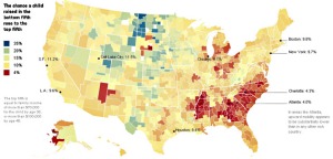
This map and work by Harvard’s Raj Chetty and others has received massive attention, as it should. There is a lot to mine from this work.
The big takeaways of the authors:
1. Mobility is heavily tied to the proximity of poor and wealthier people; in other words, where population remains segregated along economic lines, kids have the lowest chance of breaking out of the poverty cycle.
2. There are models today where that proximity does NOT drag kids down. A child growing up in poverty in Atlanta has virtually no chance of making it into the top income tier. A poor child in Salt Lake City has almost an equal chance of upward mobility as one born to wealth. In other words, the problem can be solved.
This map should be hung in some state houses. It should be hung behind the dais of boards of school trustees and published where it will cause the most outrage. The life and death of the American dream is not related to poverty but to social structures which trap children into the cycle of poverty. Those are two very different things. Educators have a role to play in make the Dream truly American, and not “American except across a broad belt of the South.”


Leave A Comment